Time files! Good thing 2016 is over, right? Didn’t blog much last year either (I’ll just accept that I’ll never be much of a blogger), but luckily others blogged about all the good things that happened to web and mobile last year! Less work for me. Still, I’d like to pull out a few high-lights. If nothing else, for my own book keeping 🙂
AMP
Accelerated Mobile Pages, by Google. (Really a 2015 thing, but still) Which is not magic, but really how web in general should be done. To be honest, I have a “meh” feeling about this. It is quite easy to make web pages fast on mobile without following the AMP guidelines, but there is of course a carrot. Better exposure in Google search. What I learned about AMP is that AMP is really a SEO thing, not a mobile specific thing. Most of traffic is now mobile, so why wouldn’t you make your site AMP friendly? Further, the most important take away here is that device detection just got a new use case. Turns out good ol’ mobile device detection just got a new use case. So, I’m still learning that knowing the browsing context is important.
PWA
Wow. Boom, and we had a new three letter thing to consider. From the perspective of making the web mobile it is very similar to AMP. Progressive Web Apps still require the server to optimize. Even if this is a giant leap towards a true mobile web compared to Responsive Web Design, there will always be cases where you need to know the capabilities of the end users device. There are different contexts on the web. The web is meant to be consumed in different contexts, and it is the servers responsibility to know and optimize.
Mobile web?
Is there a mobile web? Well, I’m still with the conclusion from 2013 that the web has always been mobile. What I am a bit wistful about is that the community of mobile web people is gone. I miss the days when everyone who knew everything about mobile and web could sit on the same table and discuss the same important topics. Never mind, I’m just getting old (passed 40 this year)! Anyway, mobile is now the web! Most traffic is now mobile (Norway below), and I am extremely proud of being a part of the team that make it happen!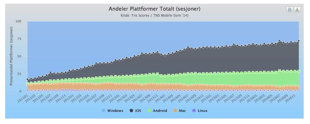
Diversity
I’ve been in the mobile web business, hands on, since 1999. Lot’s of stuff has happened! The main use case for the web is now mobile! When I started in the business, I personally knew everyone using web on mobile in Norway! (Almost). Still, in 2017 where most traffic is mobile, it’s the same issues that are discussed. All related to the diversity of “things” that can access the web. The community have had several detours (still steps in the right direction…), like jQuery Mobile, RWD and Respimg, but during all these years there has always been better solutions server side. Web performance starts with the server knowing as much as possible about the end user’s reading context.
Wonder if that will ever change….
How the diversity of devices and ways to access the web is handled, thought, has changed a lot. While in the early days, you’d have to cater for mobile diversity in the web app, now much of the work is done at the edge of CDNs or in the network infra structure.
Analytics
Do you know how many users access your site through Facebook? You’d be surprised. Do you know how many old, slow iPhones or iPads are accessing your site? An iPhone is not an iPhone. While your webpage is fast on a recent iPhone it may be useless on an older iPhone due to processing power. Make sure to monitor that as more people stick with their iPhones longer.