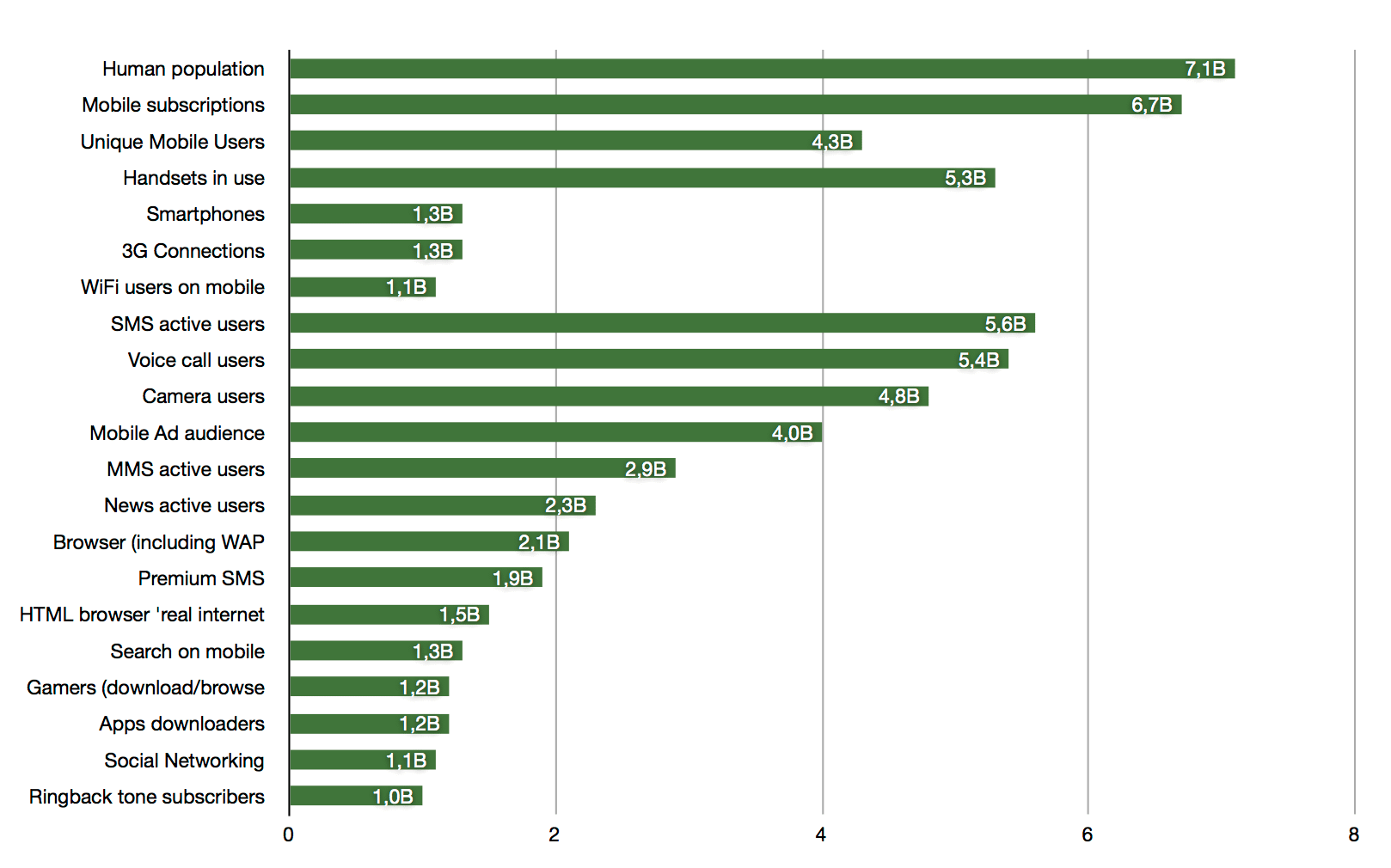
It is that time of year when Tomi Ahonen has been working his Excel-sheets and now finally published the numbers we (me at least) have been waiting for since January this year.
As always, there’s not only numbers, but also quite a lot of text.
I have taken the liberty to make some graphs out of it to put things into perspective. Helps me, anyway.
If we look at some of the numbers compared to how many people surf the web on a mobile phone, it looks like this:
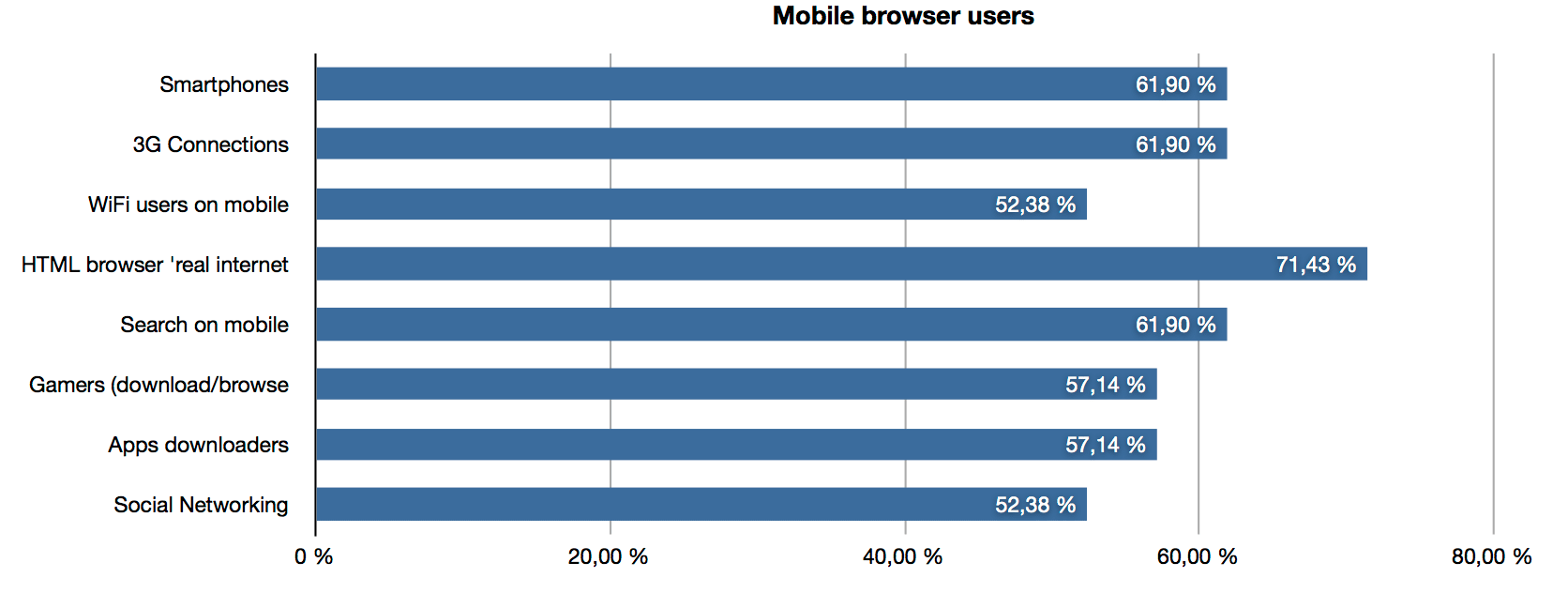
One can discuss at what percentage “critical mass” is for “real html browsers”, but I think we are getting close.
The connectivity part is also interesting. Numbers show that designing lean sites is key for mobile user experience.