Progressive enhancement, Responsive web design and Adaptive layout are all new «buzz words» when it comes to web design and more specifically design of mobile web sites. Drizzle some HTML5 and CSS3 over it, and you have your self a perfect meal of hype (btw: sometimes this dish of hype is called just «HTML5»).
Well, hype is a strong word, but there are certainly some misunderstandings about what responsive web design (RWD), HTML5 and CSS3 can do for mobile. It is neither the Holy Grail nor the silver bullet. This discussion is reaching philosophical levels all over the web currently, so I’ll try to be short and specific:
First, what is the difference between Progressive enhancement, Responsive web design and Adaptive layout?
Well, when it comes down to it, probably not that much. The general idea is that content is laid out differently depending on the screen size of the device accessing the web page, and that the layout and presentation is progressively enhanced (by using media queries and JavaScript) as the screen increases in size.
At least, this is how many out there implement it. To me, none of these terms really covers all aspects of what they claim to solve. Coming from the «mobile world» I have discussed the «One Web» philosophy before, and, to me, this current discussion on RWD is just the same, but this time focused on implementation. That means we are one step closer to something.
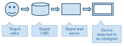
I say «one step» because the current discussion and early implementations forget something very important. I will call that context (I will discuss this below). The current value chain in many fancy HTML5 RWD projects look like this:

The editor write stuff for the desktop web. The CMS thinks the content is going to the desktop web. The web server don’t know anything about the device or context of the reader. The consuming device is left with all the hard work of being responsive, adapting the layout and enhance progressively.
That’s not fair, right or smart. If you love your end users and value user experience this is not the solution.
It is not only the design of the web site and the layout of content that needs to be adapted of enhanced; the idea of being responsive, adaptive and enhancing, must be implemented in the whole value chain.
The Editor and CMS
Luke Wroblewski is talking about this in his «Mobile First» presentations, even if he is not calling it RWD or anything else, he addresses the process of designing and publishing content to a device or context you know less about at the time of producing the content. The editors out there need to start thinking like this. The CMS vendors must build functionality to support this.
The Web Server
In modern publishing of digital content there are many «unknowns»:
- The network speed
- The cost of data traffic
- The clients processing power
- The interaction model (touch, mouse/keyboard, joy stick, remote control etc)
- The screen/viewport size
- Support for content types
- The user: is he mobile or static?
This type of contextual information is important. In todays RWD approaches this problem is not addressed, by leaving all the difficult decisions to the client compromising the usability of the site.
You might understand where I am going with this. I am all in favor of RWD and stuff, but the current discussion is missing out on what mobile really is. Even if we can make the site look decent on smaller screens using media queries and JavaScript magic, there is still need for server side processing. Current attempts on RWD will send the same markup, css, js and content to all client. This means that a mobile device will download tons of markup, css, javascript and content that will not have a function on the mobile device. For example, showing fewer news items on the front page is solved by «display: none;» in the css, image resizing is solved by «width: 100%» (put to the extreme).
So, the web server needs to be responsive too. The web server should take care of things like image scaling, some media query processing, markup processing etc. This way the client will get only what is needed to present the content. Data traffic is minimized and the client doesn’t have to use so much power to just render the page. Time and money saved for the end users, which must be a great recipe for happy customers!
Concluding
It is not my intent to offend any editors, web designers or RWD fans! My point here is that the current «trend» in the market right now, to lean on the silver bullet HTML5, and the smartest innovation since the printing press, RWD, will not solve the technical issues nor the content/design issues. More is needed. All stakeholders in the value chain needs to be involved to create a true «one web», or usable content across all contexts.
RWD is an important step towards what we want to achieve: A great user experience when surfing the web on all devices. Is the mobile web becoming desktop-web-like as some were advocating a few years back? No, I think the web is becoming mobile aware.
The next issue
The «SEO’ers» among you have probably seen the issue already. «User-Agent cloaking«. This is where you present different content, or a different page, depending on the user agent. An old trick from SEO. Google is not that fond of that… However, when it comes to mobile, Google is OK with this. However, I don’t feel 100% comfy on this as Google mobile search appears as a random mess to me…
7 Responses to Next steps of Responsive Web Design